The menus in my system

Translations: br
Publication date: Dec 28, 2021
Tags: rofi, desktop

Another post going through stuff I set up for my desktop environment a couple years ago and that have used ever since 🙂. This time I'll show the menus I've created using rofi.

So, what is rofi? It's basically a program where you feed a list of options to it, and it shows a window where the user can filter and choose an option. So simply put it is a simple universal selection menu.

Rofi also has some default menus, like one to launch applications and another to switch windows, which are probably its most common use. I also use these menus, but since they aren't something I customized myself, I won't talk about them.

My menus

The menus I created with rofi are: power, screenshot, unicode and music.

Power

{image}/power.png

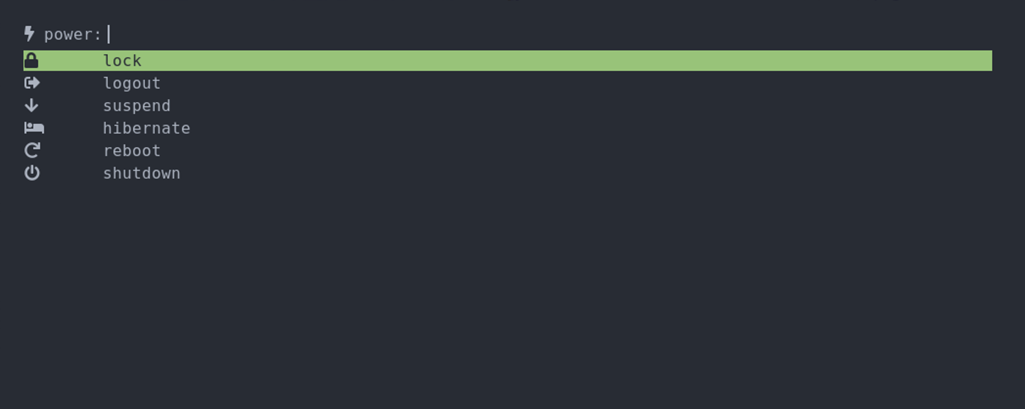
This is probably the most important menu to have when your desktop environment doesn't have its own power menu (e.g. in my case, I use sway which is just a window manager and doesn't have any menu of its own). This menu is bound to Super+Shift+P.

Each option is probably self-explanatory. They're sorted from least "damaging" on top to most "damaging" on the bottom, so that I don't accidentally shutdown and lose my work when I just want to lock the screen, for example, since there's no confirmation pop-up.

Since lock is the first option, simply opening the menu and pressing Enter already locks the screen. The other option I use the most is hibernate, which I just need to press h for it to get selected, followed by Enter to hibernate. In the rare cases I need to really shutdown I use w, and for reboot, I use re. Of course I can always cycle through the options using Ctrl+N and Ctrl+P as well, but the letters are usually faster.

The reason there's a lot of space between each icon and the text is because each icon has a different width, so in order to have the text of all entries aligned, I had to put a tab character after each icon. The same is done in the other menus.

Screenshot

{image}/screenshot.png

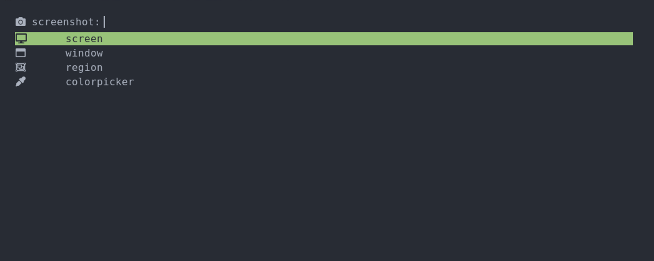
The screenshot menu is bound to Super+Shift+S.

The screen option takes a screenshot of the whole screen (including external monitors). It calls grim under the hood to take the screenshots.

region invokes a cursor that allows me to select the rectangular shape that will be screenshot. This is done by calling slurp, which gets the selection from the user, and feeding the resulting coordinates to grim through its -g flag.

window also invokes a cursor, but it is used to select a single window to screenshot. This is done by parsing the dimensions of the windows from sway, and then feeding those as the options to slurp which will then only allow one of those rectangles to be selected. The command to do that, available in slurp's README, is:

swaymsg -t get_tree | jq -r '.. | select(.pid? and .visible?) | .rect | \"\(.x),\(.y) \(.width)x\(.height)\"' | slurp

colorpicker invokes a cursor as well, but doesn't take any screenshot, instead the pixel that is clicked will have its RGB value copied to the clipboard.

Unicode

{image}/unicode.png

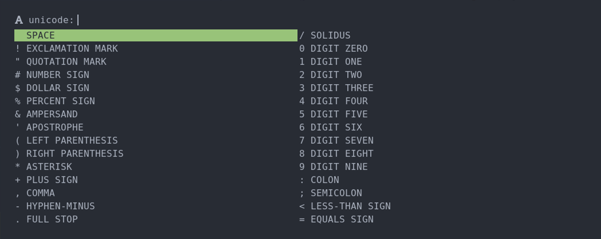
The unicode menu is bound to Super+Shift+U.

The purpose of this menu is to make it easier to access characters that I don't normally have mapped in my keyboard. It shows each character followed by its name. Since there are so many characters, I use two columns on rofi so I can see more at once.

To use this menu I write the name of the character I want and, after it gets selected, I press Enter to copy the character to the clipboard. I can then paste it wherever I need it.

One example usage is to get the ordinal characters used in Portuguese: ª and º (called Feminine and Masculine Ordinal Indicator, respectively). These are mapped in the Portuguese keyboard layout, but to me it's easier to search for them in the menu when I want them than finding them in the keyboard.

This menu is generated from python using the unicodedata.name() function to get the Unicode name for each character, and chr() to get the actual character. wl-copy is used to copy the character to the clipboard.

Music

{image}/music.png

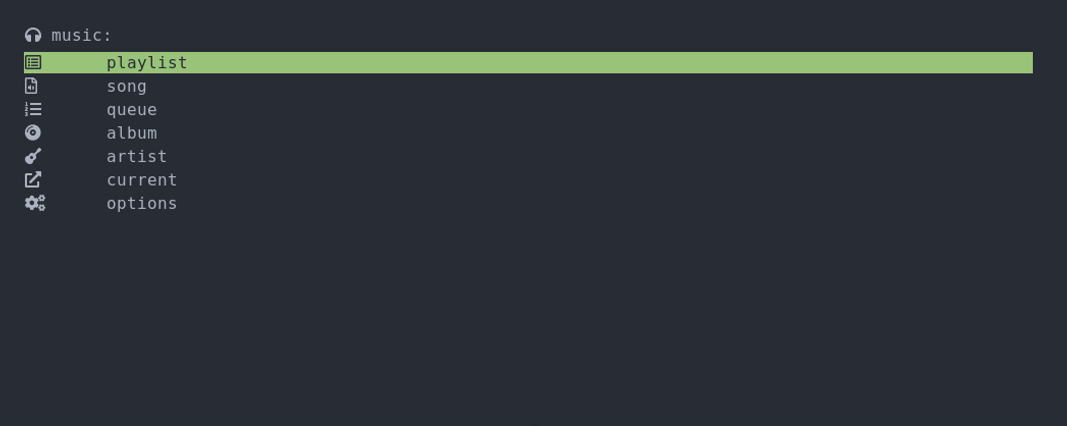
The music menu is bound to Super+Shift+M and it's my favorite! Each option opens its own sub-menu. It has all that I need to always be able to quickly play the music I want.

One nice detail is that if a song is already playing, whatever you choose will only play after the current song finishes. Otherwise, if no song is currently playing, it starts playing immediately. This way the current song is never stopped midway which is great.

Also, differently from the other menus, the music sub-menus allow (when it makes sense) selecting multiple options by using Shift+Enter instead of just plain Enter when selecting, although I seldom use this.

Let's see each one of the sub-menus.

Playlist

{image}/music-playlist.png

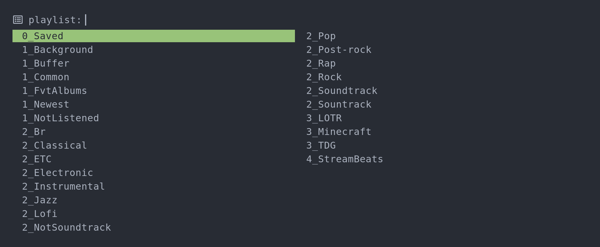
The playlist menu allows me to start playing any of my playlists. Randomization is automatically turned on when I select a playlist, so that the order of the songs in the playlist aren't always the same.

The playlist I listen to the most, Saved, is the first one on purpose. This way when I just want to start listening to something, it's as easy as Super+Shift+M, Enter, Enter. Listening to background music when I have to concentrate is also pretty easy: Super+Shift+M, Enter, Ctrl+N, Enter.

In case you're curious about how the playlists themselves are created, I've already talked about that on the "Playlist generation with MPD" post.

Song

{image}/music-song.png

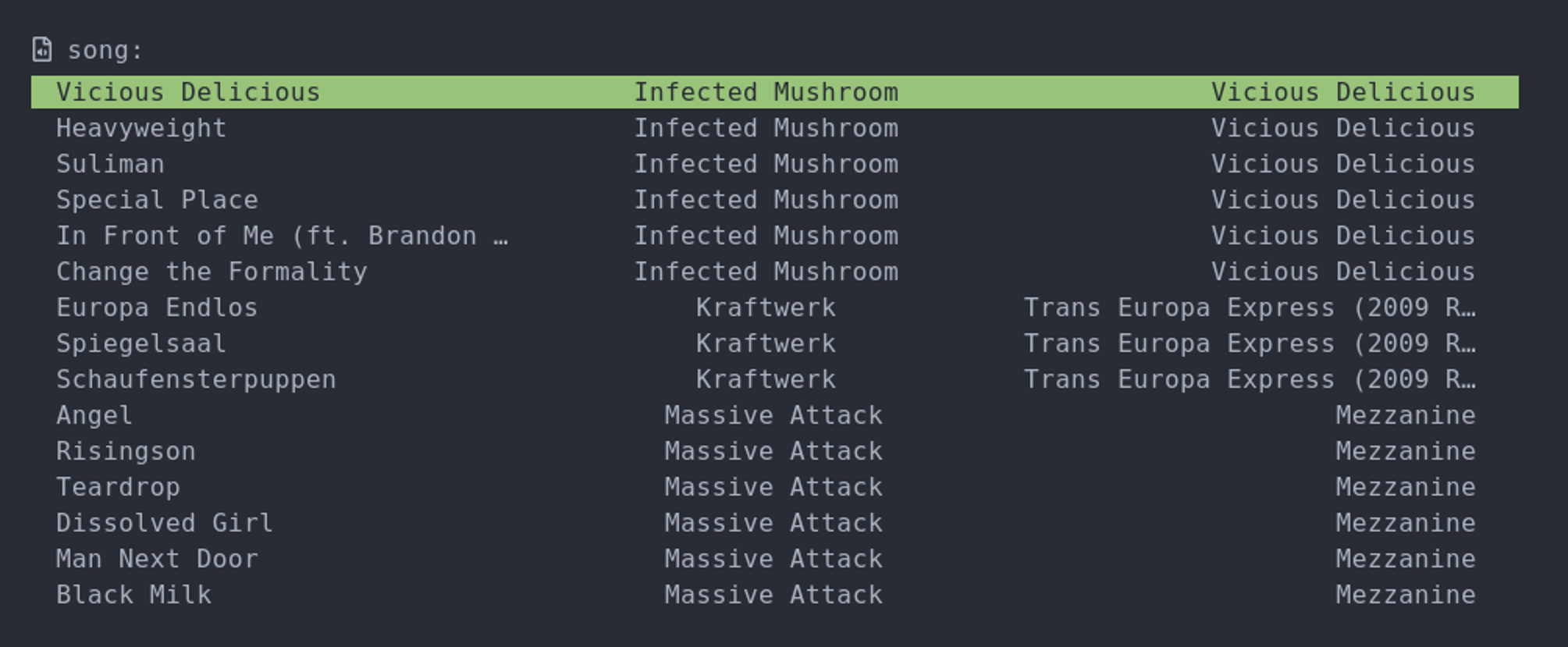
The song menu is for when I want to listen to a particular song. Each entry shows the song name, artist and album. rofi doesn't support showing multiple strings in the same entry like this by itself, so to achieve this I need to construct a string with the same width as the rofi window, with each field occupying an equal amount.

To have a more or less predictable width I fix rofi's width to be character-based by putting width: -100; in its config. I then make this value available inside the python script for this menu by simply reading the value from this config (not pretty, but works). I then calculate the width each field should have and add spacing and/or truncate each of the fields individually as needed for them to keep the right width.

Since the font I use in rofi isn't monospaced, the width I set in the config is just an estimation and not precise in any way. So there can be a bit of extra slack, but it works well enough.

Queue

{image}/music-queue.png

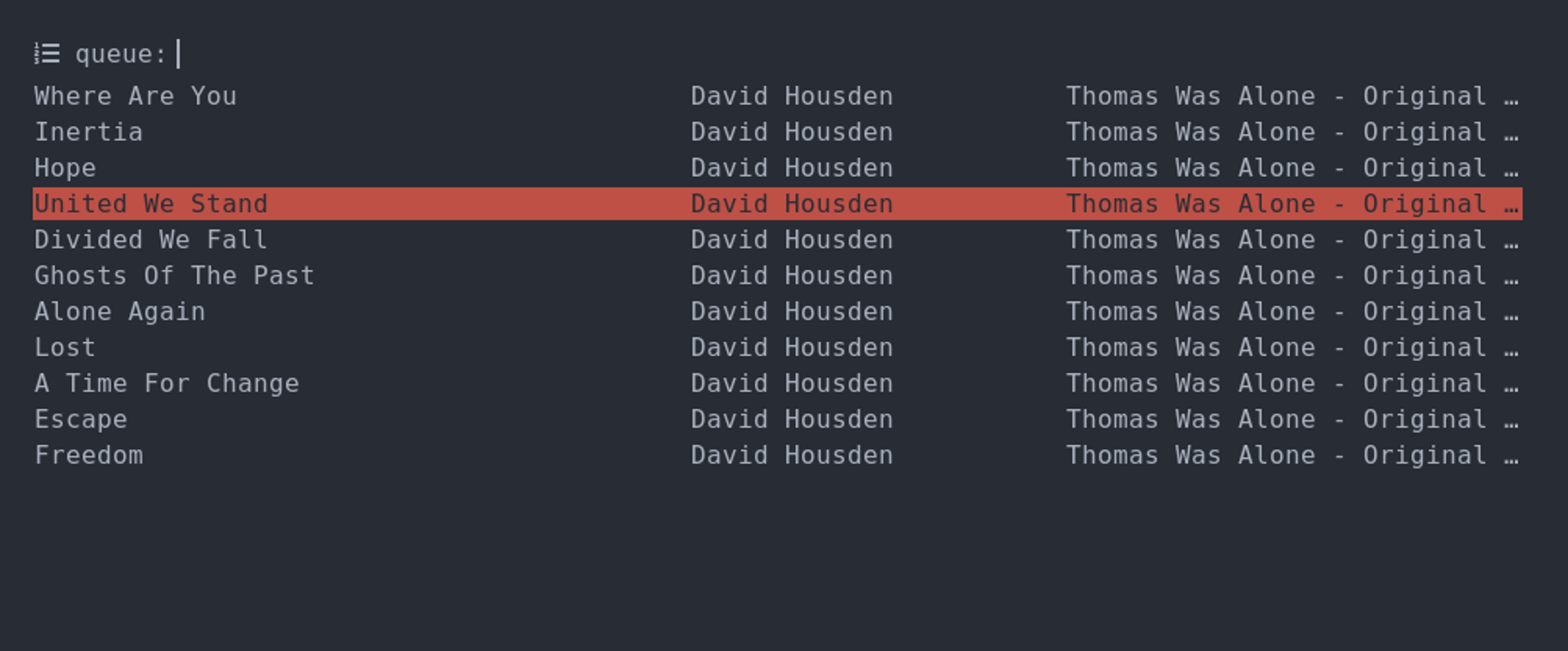
The queue menu shows the current queue of songs that are playing. I use it whenever I want to see which songs will play next or play a different song from the current queue.

When this menu is opened the cursor starts on the currently playing song.

Album

{image}/music-album.png

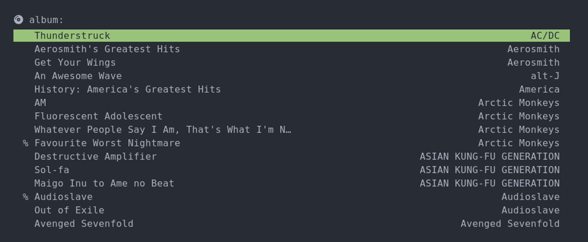
The album menu lets me choose an album to play. One important distinction is that playing an album turns randomization off, so that the songs in the album are played in the right order, while the Playlist and Artist menus play with randomization turned on.

Each entry shows the album and artist name. On the front there's also a % to mark what I call "full albums". The criterion is that if I like at least 80% of the songs in an album, I mark it with a %, and listen to it whole, even the songs I didn't quite like. On the other hand when I like less than 80% of the songs in an album, I just listen to the ones I liked.

The idea behind the "full album" concept is that I think there's some value to listening to an album as a whole, but I also don't think it makes sense to listen to a whole album when you don't like most of it. So I have that 20% slack so that albums don't need to be perfect before I'm willing to listen to them wholly.

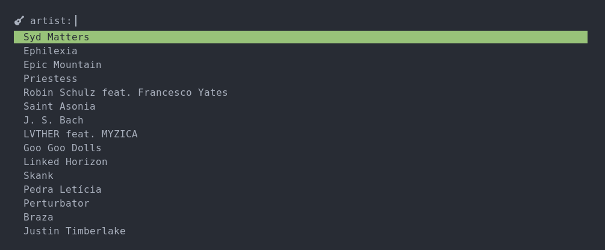
Artist

{image}/music-artist.png

The artist menu is the one I use to play all musics and albums from a single artist, in no particular order.

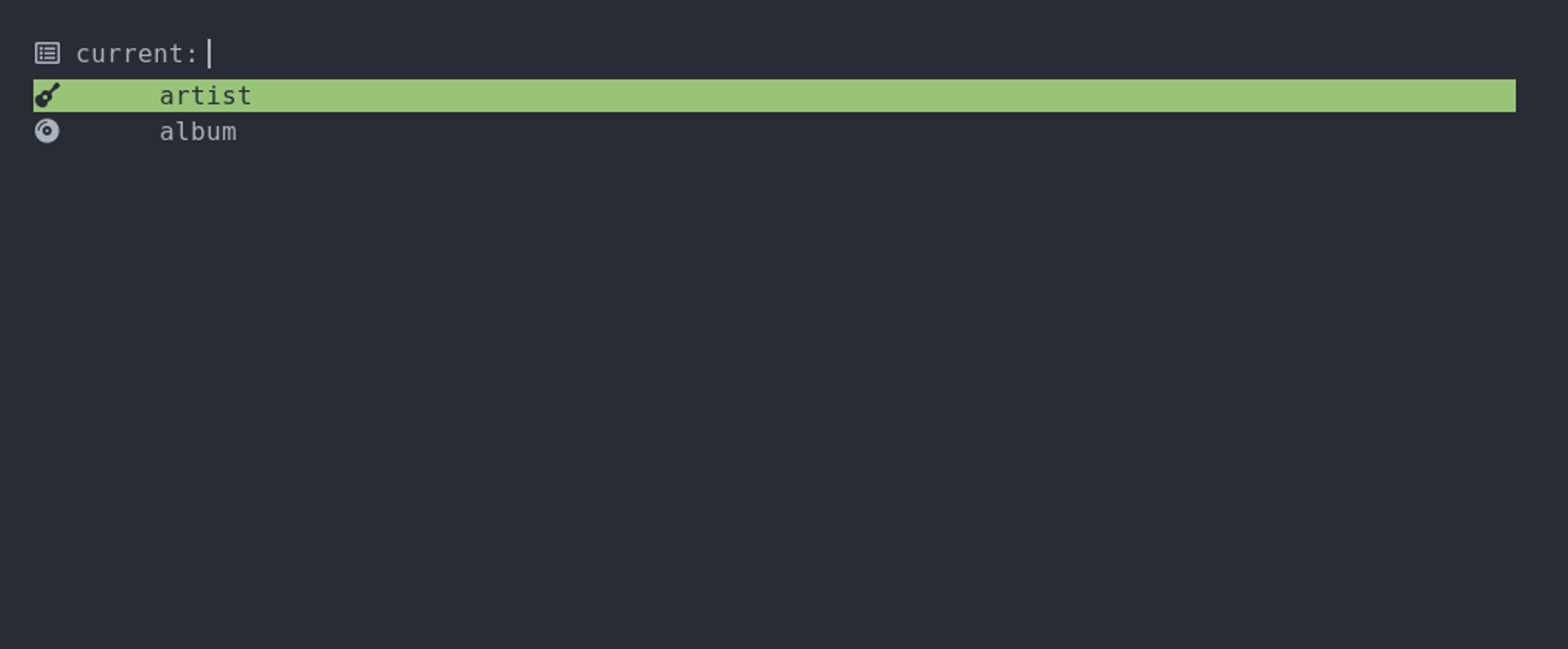
Current

{image}/music-current.png

The current menu is a very new addition! I noticed that I'm sometimes listening to some playlist and a song plays that makes me want to listen to its whole album or to all songs from that artist. This menu allows me to do exactly that.

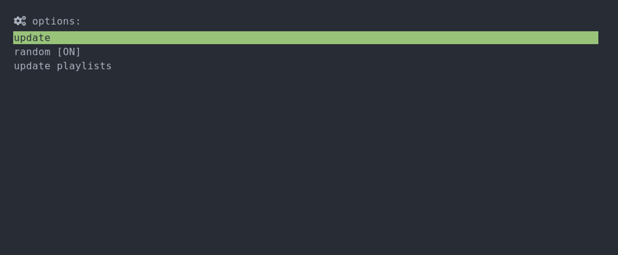
Options

{image}/music-options.png

The options menu gives access to some extra functionalities. update causes MPD to update the music database, which is sometimes useful. random toggles the music randomization. I rarely use this since I have already configured my menus to turn randomization on or off depending if it's an album or not. update playlists re-runs my playlists generation script so they get updated.

Other considerations

Those are my menus and what I wanted to share in this post, but it's worth mentioning a few other points.

First, there's another rofi menu that use, although it isn't one that I created myself. It's called rofimoji and allows you to very easily search for and copy emojis.

Second, it's worth mentioning that rofi officially only works on X11, so I actually use the rofi wayland fork, as I've mentioned on the "Moving to Wayland" post.

And finally, in order to more easily create rofi menus from my python scripts, I've wrapped rofi in a python function with the following prototype:

def select(prompt, options, multi=False, args=[]):

where prompt is the string that shows in the prompt, options is the list of options that can be chosen from, multi is whether multiple options can be selected or not, and args allows passing additional arguments to rofi. The return of the function is the option(s) that was/were selected (just the option if a single one, and a list of the options if more than one). If the selection was aborted an exception is raised. I considered using python-rofi instead of creating my own, but that module returns the index of the selected entry instead of the entry itself, which I found would just make it more convoluted to use. Since it was pretty easy to create my own module, I just went for it.

That's it. I really like how easy it is to make menus using rofi from python 🙂.